RSS and Atom are established open standards for syndication on the open web. These standards have existed for a long time and served as a base for social media sites where users build individual feeds based on their interests. Unlike social media, RSS and Atom do not lock users into a specific platform – they stay open and accessible regardless of platform, media, or tool of choice.
We treat RSS and Atom feeds as part of our openness strategy. Our position on Claz is that platform content should stay available and reachable, as legitimate means for users and other platforms to stay informed and syndicate their interests. We intend to continue supporting syndication rather than building a walled garden on our platform.
At the same time, abuse is real on the open web: user-submitted content is constantly used for scams and for the unsolicited training of AI models. We use proportionate defenses to the best of our ability, and we still believe that a meaningful part of search should remain open through these standards for people, tools, and other platforms.
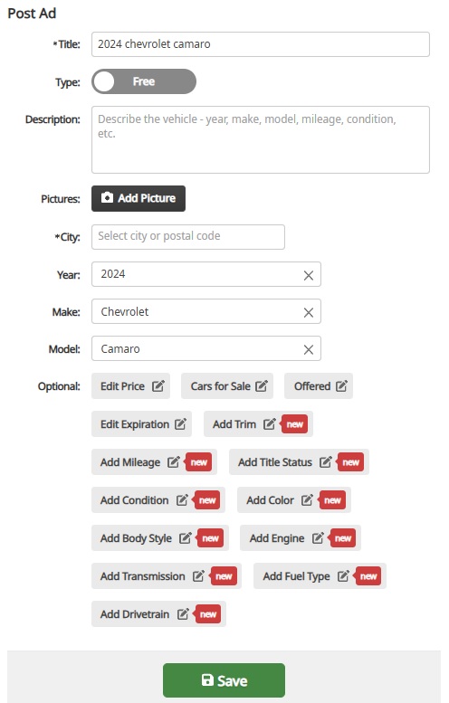
We updated category attribute editing on Post Ad and Edit Ad pages after users asked for it.
What changed
The fields shown depend on the category selected. Pick Cars, Rooms for Rent, Apartments for Rent, Dogs, or another supported category, and the relevant attributes appear on post and edit pages.
Housing – bedrooms, bathrooms, square footage, furniture, pet policy, and smoking policy for rentals and homes for sale. Rooms for Rent also get bathroom (private or shared), gender preference, number of roommates, and street address.
Vehicles – year, make, model, trim, mileage, title status, condition, color, body style, engine, transmission, fuel type, and drivetrain, depending on whether the listing is a car, truck, motorcycle, or similar.
Pets – breed, age, gender, and vaccination status for dog and cat listings.
For-sale items – condition where it applies.
The same attributes are available when posting a new ad and when editing an existing one.
How it works
1. Choose a category. The page loads the attributes that category supports from the server – one source of truth, not hard-coded per page.
2. Fields start collapsed under Optional, so the form stays clean. Open only what you need via links like Add Year, Add Breed, or Add Pet Policy. When several fields are still empty, Add optional details reveals the rest.
3. As you type the title and description, Claz recognizes attributes in the text and fills matching fields – for example, “2018 Honda”, “45k miles”, “unfurnished”, “no pets”, or “Rottweiler puppy”. Mention a detail once; you do not have to enter it twice.
4. If you clear a field or set it yourself, the system does not overwrite your choice when the text changes. Auto-filled values update only while they came from recognition – not values you saved on purpose.
5. Save the listing. Structured attributes make the ad easier to find, filter, and trust.
Why it matters
Search works best when listings describe what buyers actually filter on. Better attribute editing on post and edit pages means fewer vague ads, fewer repeat questions in messages, and better matches across housing, vehicles, pets, and more.
The updated structure also makes it straightforward to add attributes for more categories over time – the same pattern, driven by category.
Let us know what works
Try the updated post or edit flow in a category you use often and tell us what still feels missing – through support or the usual feedback channel.
For anyone who posts on Claz regularly, My Listings is where ads get paused, status gets checked, or an edit starts. That page was rebuilt to feel closer to My Favorites – visual cards instead of a dense table, especially on a phone.
What we did
– Card layout with photo, price, and status on each listing
– Keyword filter to find a specific ad in a long list
– Rich details on each card – location, category, availability, and key attributes (same idea as Favorites)
– Quick actions on the card: start, stop, and a ⋯ menu for edit, premium, share, and delete
– Bulk actions – stop all, start all, or delete inactive listings in one step
– Mobile polish – cleaner layout, full-width action bar, and a bottom sheet for the ⋯ menu
Why we did it
A table works for a handful of rows. It does not scale when someone is juggling dozens of listings across categories and statuses. Feedback was clear: scanning status, finding one ad, and pausing another took too many clicks – and on mobile it was worse.
The account area should also feel consistent. My Favorites already uses cards; My Listings now matches that look.
How it works
1. Open My Listings from the account menu.
2. Use All / Active / Inactive / Rejected tabs, or type a keyword to filter.
3. Listings are grouped by date posted so recent ads are easy to spot.
4. Tap pause or play on a card for a single listing, or use Stop All / Start All at the top.
5. Tap ⋯ for edit, upgrade to premium, share, or delete.
The views chart still appears on the first page when traffic data is available.
Let us know what works
Anyone managing multiple listings can try the new page and share what still feels clunky – through support or the usual feedback channel.
Over the past few weeks we’ve been working on improving our AI assistant, mostly adding new capabilities and focusing on user experience. Our goal is for the assistant to be able to automate most of our users’ day-to-day tasks and handle most of the customer support inquiries quickly.
What AI assistant can do today
Proactive help. AI assistant will reach out to the user if an important detail is missing from their listing and the assistant cannot figure it out from the image or the description. The assistant will use our internal messaging system and will offer help with populating the missing details on the spot.
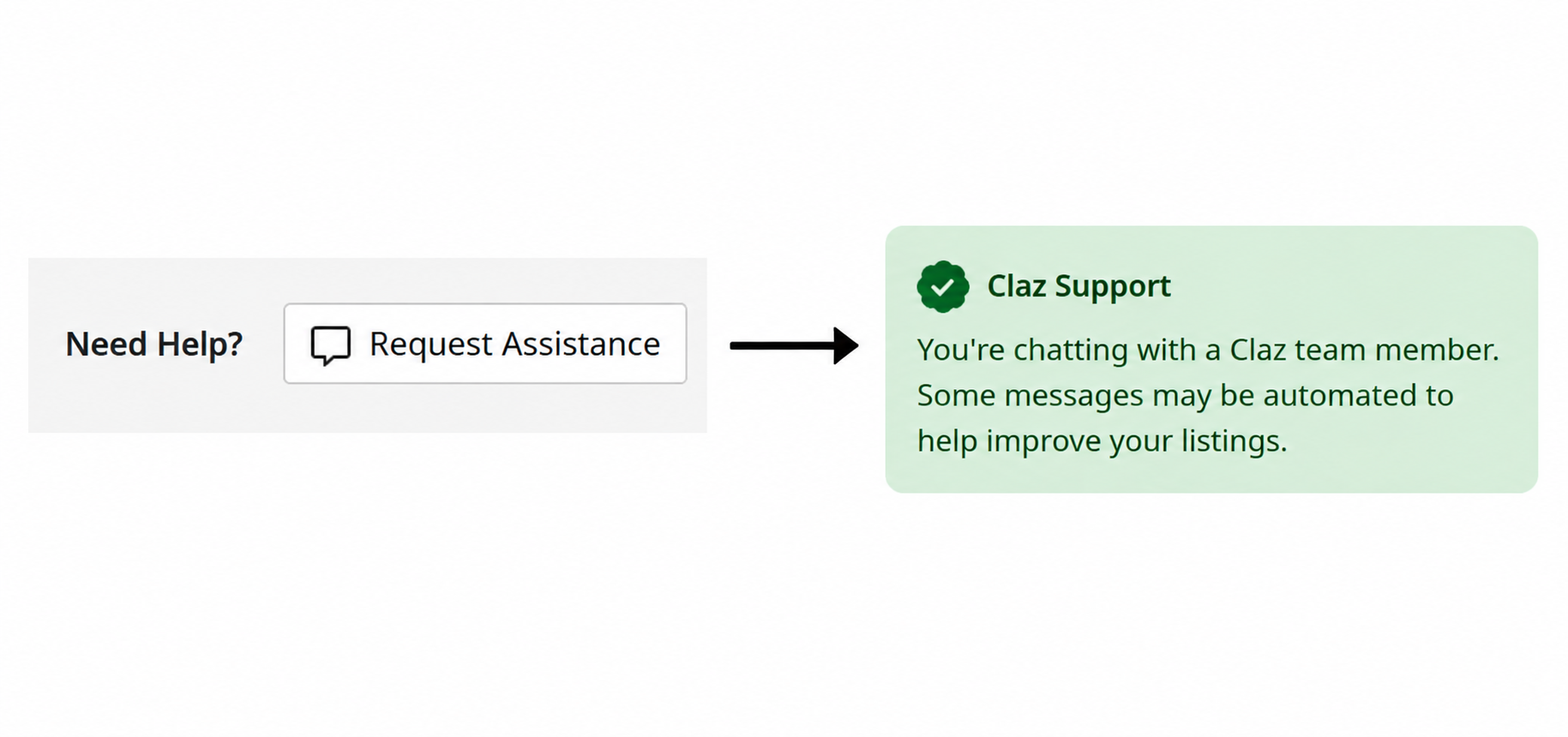
Request Assistance. We’ve added “Request Assistance” button to some of the user pages, making it easier for our users to initiate a conversation with the assistant.
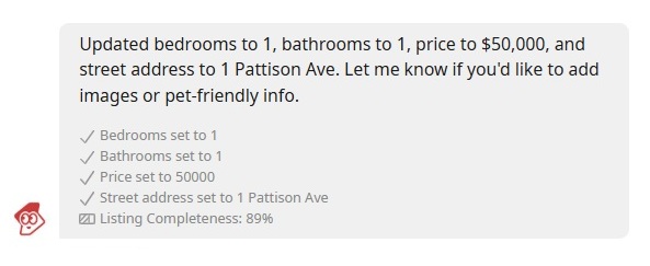
Manage listings and profile details in chat. Users are now able to edit most of their listing details in AI assistant chat, including title, description, price, location, category, photos, and category-specific fields like dog breed, bedrooms, dates, and more. Users should be able to upload photos of the listing and the assistant will automatically add them to the listing on request.
Activate, pause, and clean up. Users are also able to activate or pause their listing from the AI assistant chat, delete or restore listings, activate or pause all of their listings at once, or clean up expired listings.
Referring to other listings. AI Assistant should be able to look up information on users’ other listings and start a follow-up conversation for a different listing as needed.
Human backup. If the assistant cannot help, it can now route your request to our support team.
You’re in control. Turn AI assistant on or off under Account / Preferences / AI Assistant. You can also use Disable Assistant in AI assistant chat.
How we made it easier
We did not build a separate chatbot or a new page to learn. The assistant lives in the messaging you already use. When it updates your listing, you see what changed – update notes and a completeness progress indicator. The listing sidebar refreshes automatically. Each conversation focuses on one listing; if you need help with another ad, the assistant opens a follow-up thread. First outreach messages are reviewed before they are sent, and rate limits keep things from getting noisy.
We want your feedback
This is still evolving. If something goes wrong, please tell us – reply in the conversation or use our Contact Us form.
We also want to know whether the assistant helped you, got in the way, or felt unnecessary. Your experience is the best signal we have for what to improve next. Real people read every conversation, and your feedback shapes what we build.
Claz is built for people – someone selling a couch, looking for an apartment, replying to an ad nearby. Lately, a growing share of our traffic hasn’t been people at all. It’s been bots.
Why now
AI and large language models have made large-scale scraping cheap and easy. The result is more automated traffic, often not gentle. That worries us for three reasons:
– Abuse of real users’ data. Listings posted in good faith can be harvested in bulk and reused for scams – fake offers, phishing, impersonation.
– Reliability. A flood of automated requests can slow Claz down for the people actually here to buy and sell.
– Fairness. Scrapers take everything and give nothing back.
What we did
The hard part isn’t blocking traffic – it’s blocking the right traffic, without annoying real users. So, at a high level:
– Smarter traffic limits, so no single source can hammer the site or vacuum pages at machine speed.
– Abuse detection that separates automated harvesting from normal human use.
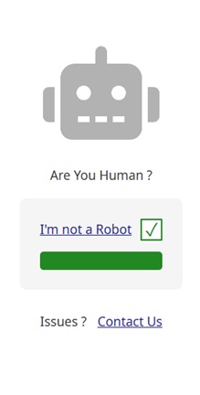
– Verification only when needed – a quick check shown when traffic looks suspicious, invisible in normal use.
What this means for users
Probably nothing. Browsing, searching, and posting should feel the same. On rare occasions a user might be asked to confirm they’re human – that’s just the system being careful, and it should pass quickly.
Tell us if we got it wrong
We’d rather hear that a measure is in your way than have you quietly leave. If anything slows you down or blocks something legitimate, please tell us – we’ll tune it. Getting this balance right is ongoing work, and your feedback is the best signal we have.
Save listings with one tap, then review them in one place – My Favorites on Claz.
We keep improving the site in small, practical steps – and Favorites is the latest one.
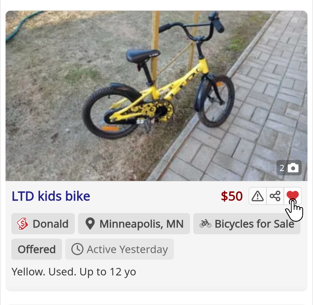
Favorites is a personal shortlist. Tap the heart on search results or on a listing page to save an ad for later. Open My Favorites to compare options, pick a winner, or reach out to sellers – without re-running the same searches or digging through old tabs.
It is for hand-picked listings, not a feed the site picked. (Already use Alerts? Alerts watch the market for new matches; Favorites hold the ads flagged manually.)
How to use it
1. Tap the “heart” on search or on a listing.
2. Open “My Favorites” to view or remove saved listings.
Not signed in? You can still tap Favorite. We will ask you to confirm email or sign in so your saves stay on your account.
Request help is a new feature on the listing details page. Next time you run into an issue, give it a go.
The assistant does what it can to help you with your listing. It has all of the needed context and tools to help you with most issues. It will forward the request to a human support person if it’s unable to help or if you need to talk to a person.
How to use it
1. Go to your listing’s details page.
2. Click Need Help → Request Assistance.
3. A conversation opens. The assistant handles most things right away and forwards to a person if it can’t handle it.
A while back we launched Smart Search to help buyers find what they’re looking for on Claz – one box that understands keywords, locations, and categories at once. Now Smart Search works on the other side too: posting and editing ads.
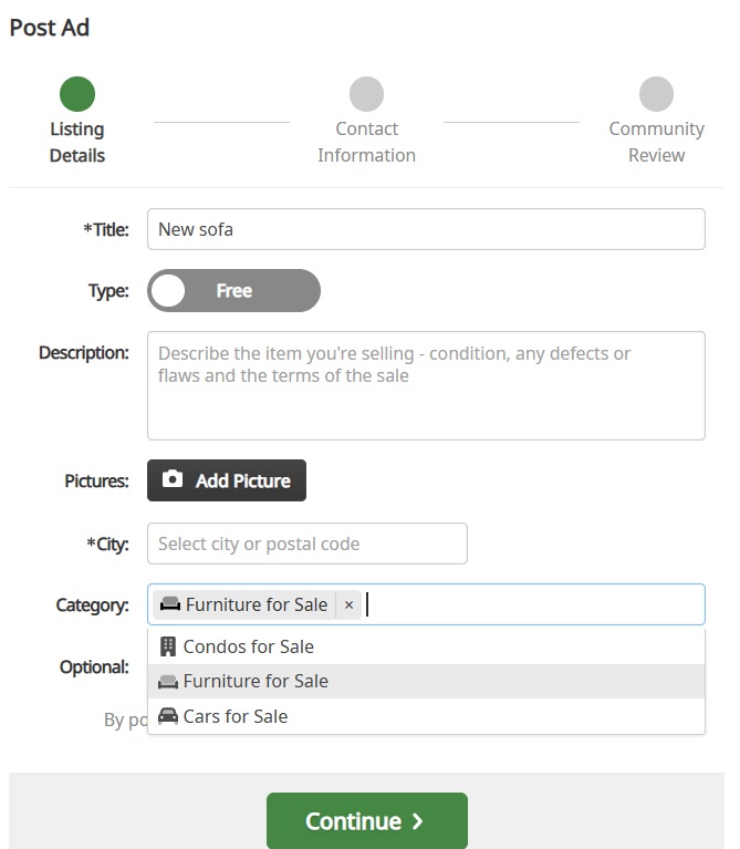
On post and edit pages, every field offers suggestions and fixes typos as you type. It pays attention to context: pick a category and the attribute and title suggestions narrow down to match what is already selected. Sometimes one word is enough – type a dog breed and Smart Search fills in the category, the breed attribute, a suggested price, and other related fields.
The same idea that helps buyers find listings now helps sellers describe them – fewer steps, less guessing, and a faster path from “I want to sell this” to a well-categorized listing.
People don’t think in filters. They type what’s on their mind: “sofa vancouver”, “used bike”, “apartment near me”. A good marketplace search should understand that one line can include a keyword, a place, or a category – sometimes all at once.
That’s why we built “smart search” on Claz. As you type, it suggests keywords, locations, and categories together, with small hints when something matches indirectly – so it’s clear why it showed up. You can also refine your choices without getting stuck, especially on mobile where the search experience needs to be fast and forgiving.
The result: fewer steps, less guessing, and a quicker path from “I have an idea” to “here are the listings I want”.
This is just the start. We’ll keep improving suggestions, relevance, and speed so search feels less like configuring filters and more like simply asking for what you want.
Listing something online usually means filling out forms — picking the right category, entering details one by one, formatting everything just right.
Claz strives for simplicity — but that doesn’t mean giving up on structure. Relevant details matter. They help people find what they’re looking for, and they help the site deliver better results. The problem is that filling in all those details is tedious, time-consuming, and inconvenient. Most services make people do more to get better results. At Claz, we make AI do more instead.
Claz has always worked to fill in structured data behind the scenes, with as little friction as possible. AI has become a powerful tool in making that happen at a completely different scale.
Extracting what’s already there
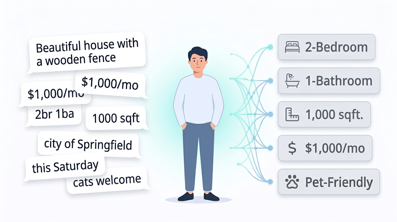
When someone lists something on Claz, AI reads what they wrote and fills in the details — price, location, dates, and dozens of other specifics depending on what’s being listed.
Someone writes “$1,000/mo, 2br, downtown” — AI picks up the price, bedroom count, and fills in the right fields. A garage sale flyer has the address on it — AI reads it. Someone writes “this Saturday” — AI resolves the actual date.
The information is already there. We make AI put it where it belongs — so users don’t have to.
Asking for what’s missing
Every type of listing on Claz has its own set of expected details. A rental needs bedrooms, bathrooms, and square footage. A dog adoption needs the breed. A garage sale needs a date and an address. AI knows what’s expected — and what’s still missing.
When something important is absent, an AI assistant reaches out in chat — the same chat used for regular conversations between buyers and sellers. It asks a simple question. The user replies naturally — “1000, 123 Main Street, ap. 7” or “2 br 2 ba” — and the assistant fills in the details on the spot.
It all happens in a quick back-and-forth — no forms, no extra steps — and the listing becomes significantly more complete without the user doing more.
Claz has always worked to take care of the details quietly and only reach out when something is truly missing. AI lets us do that better and at a much greater scale.
Everything at Claz is created by real people. We make AI work harder so their listings work harder for them.